


The myth of Icarus' fearless flight towards the sun is one of timeless rebellion. That same adventurous, bold attitude can be found at the core of tattooing culture. In response, I created a brand identity for a tattoo parlor around that same sense of adventure and rebellion.

Icarus Ink Logo
In keeping in that theme, I too wanted to rebel with the branding of Icarus Ink and make it a dichotomy of both itself and what’s expected of tattoo shops as a whole. Monochromatic black, grey, and whites are countered by vibrant, neon purples and pinks. The contrast of these colors pull clients away from the all-too expected black, red, and white that is seen in many tattoo parlors and gives them something that is different and unexpected.
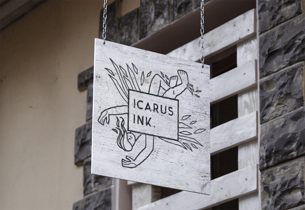
Icarus Ink - Signage
This color scheme is reflected throughout business cards, apparel, and stickers offered at the tattoo shop.

Icarus Ink - Business Cards

Icarus Ink - Apparel
Grecian-styled type in the logo and branding of the store harkens back to the story of Icarus. Branding is also carried through a variety of take-home aftercare products, including anti-bacterial ointment and scent-free lotion.

Icarus Ink - Aftercare Products
Icarus Ink - Promo Bumper


